Apeach x Vita
(Jun 2022)
Illustration Packaging Design
(Jun 2022)
Illustration Packaging Design
Using the PeachFiv characters from Kakao Friends, a group of popular animated mascots from Korea, combing it with the iconic Vita Lemon Tea design from Hong Kong. The cute and kitshcy design bringing out small happiness in every day life.


The packaging design displays the cheeky and mischevious characteristics of the PeachFiv characters, using the back as a charming focal point.
LOONAverse x Penguin Books (Dec 2021)
Branding
Branding
A advertisement campaign for Penguin in collaboration with K-pop group LOONA, making use of the apperance of Penguin books as refrences of their well-established lore in LOONA’s music videos. Lending LOONA’s voice to promote Penguin books to be an unmissabe part of pop culture.


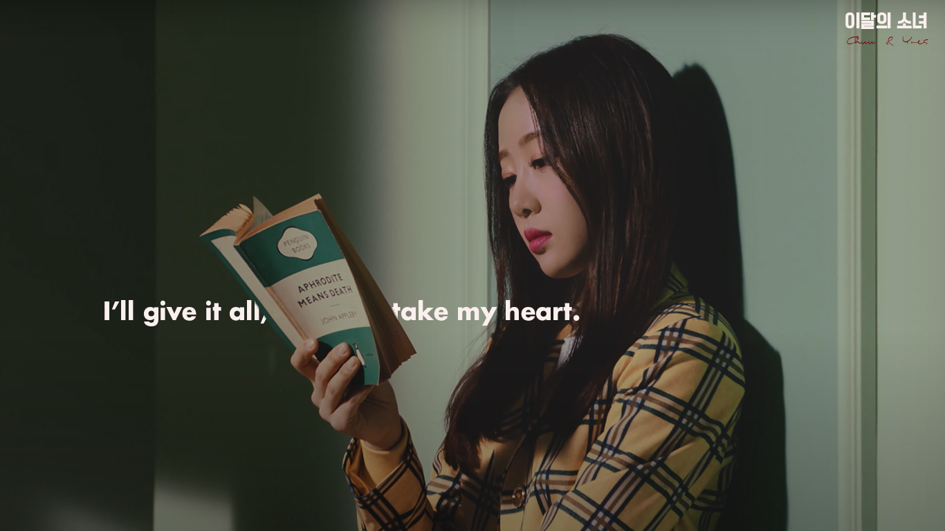
Screenshots of Aphrodite Means Death from Heart Attack MV (2017), using song lyrics as well as Penguin animal logo to resonate a bigger connection between the two brands and fans.

Refrence to East of Eden in the group’s release of Paint The Town in 2021, ”We ain’t gotta East of Eden so keep it”, as well as using fruit imagery of LOONA’s subunit yyxy whos lore is based on the Garden of Eden.

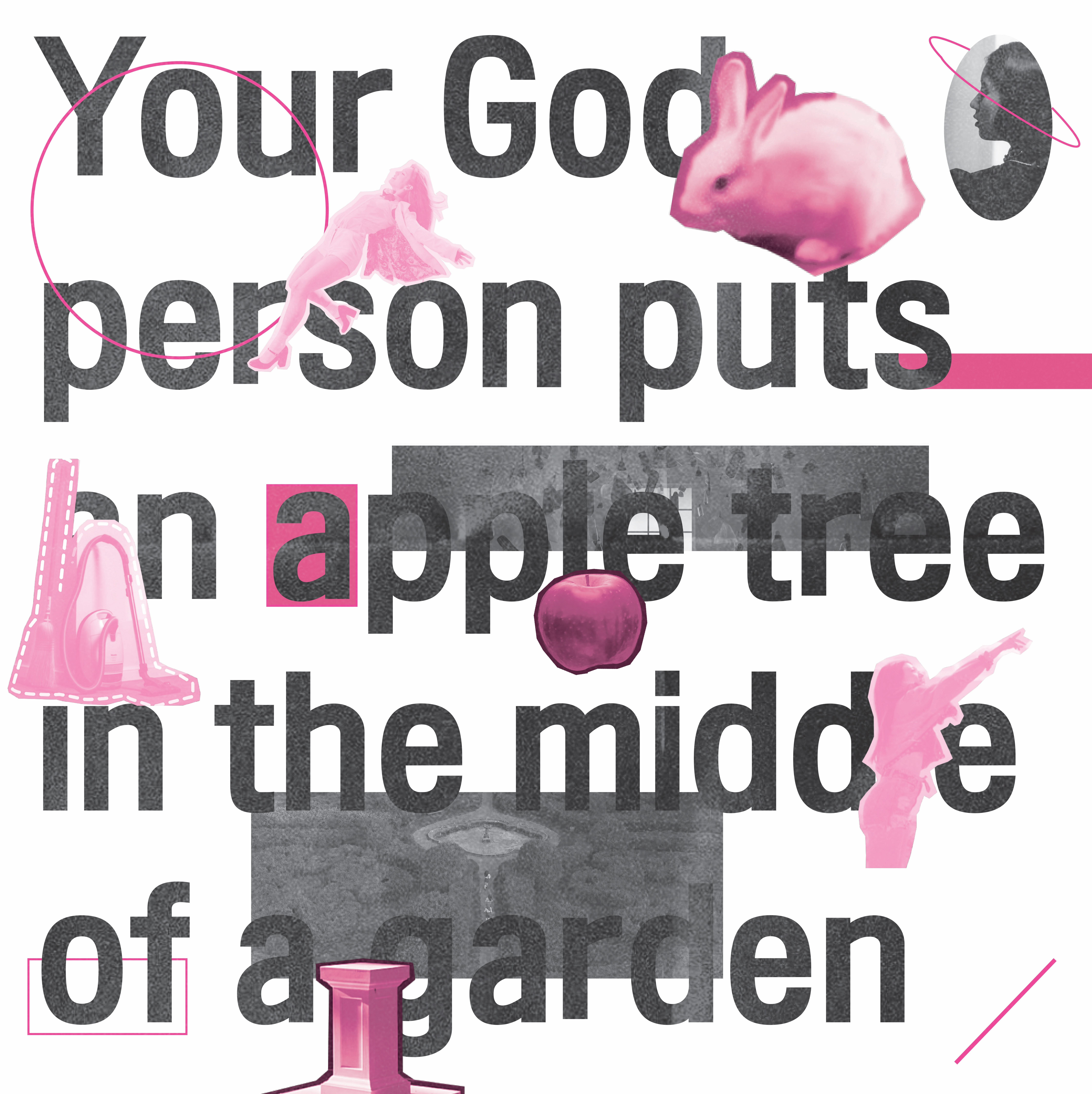
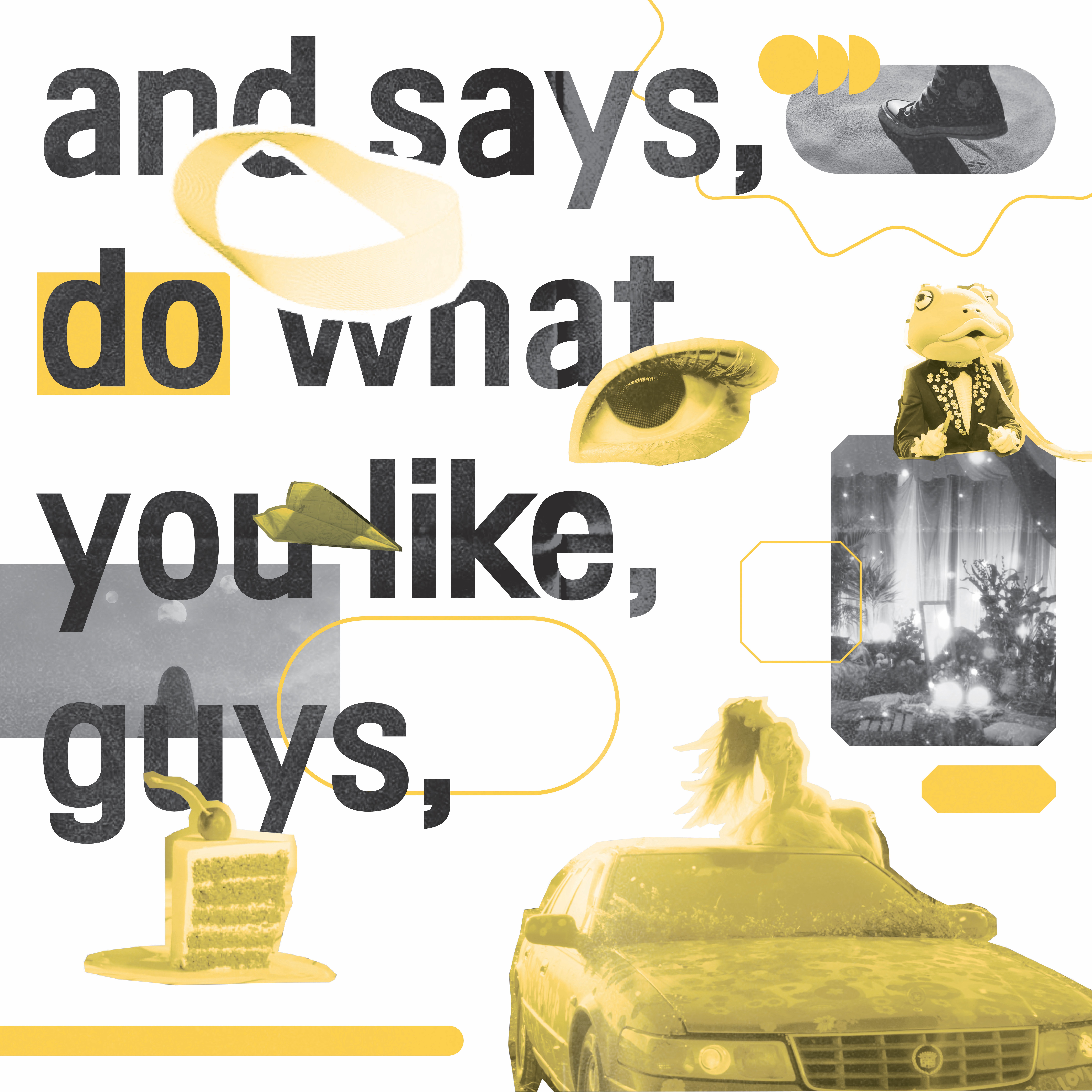
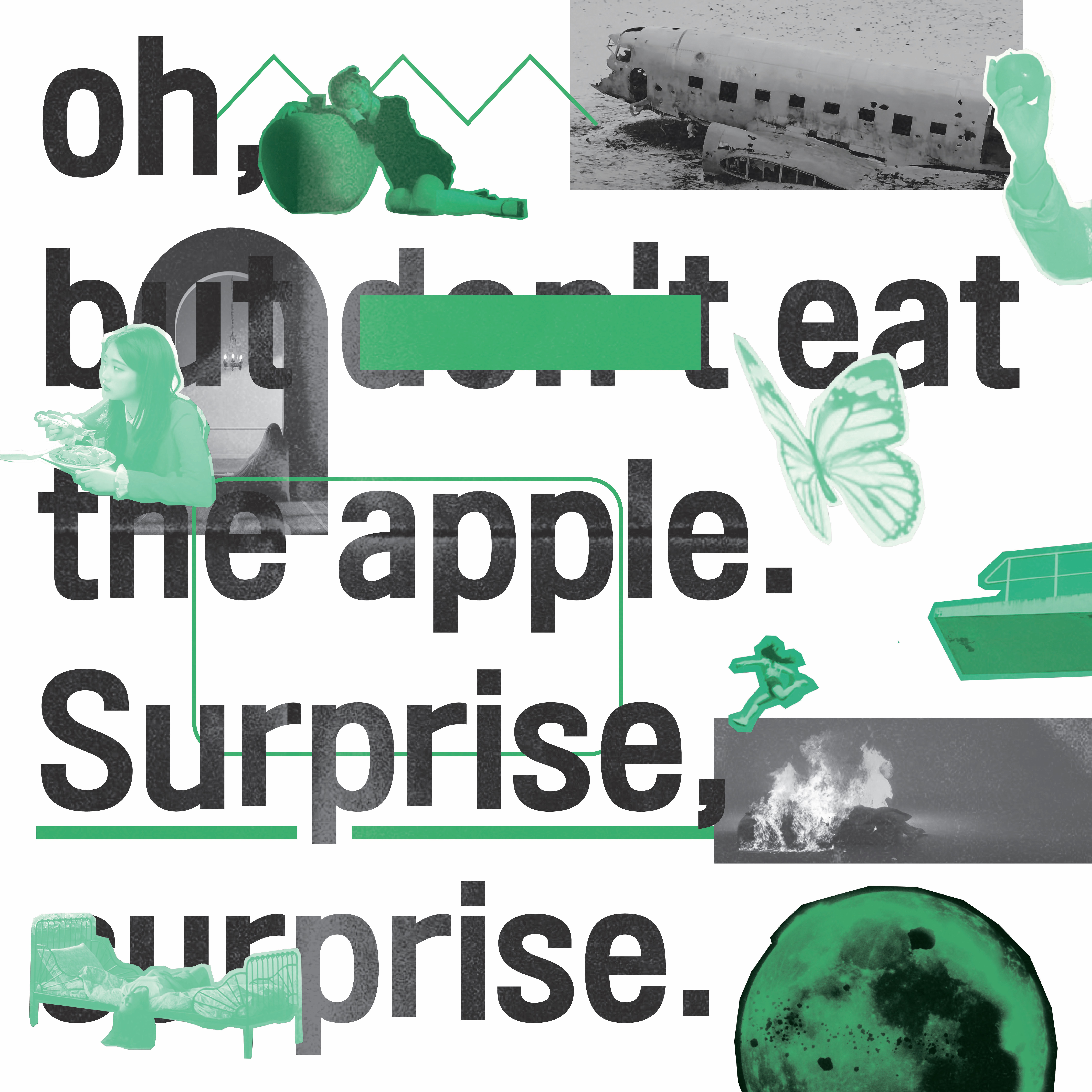
This design focuses on the creation of the LOONAverse, heavily linked to an extract of “The Ultimate Hitchhiker’s Guide to the Galaxy”, uses a wide variation of crucial icons and colours in LOONA’s lore.


Take a look at all the fun designs I’ve created!

